
kokí
Puerto Rican character.
One recognizable brand.
- Cultural references & art direction
- Website design & development
- Menu design & editable Canva handover
The challenge
kokí needed to express its Puerto Rican character while helping guests navigate the food: both people who know the dishes by their traditional names and people discovering them for the first time.
Our approach
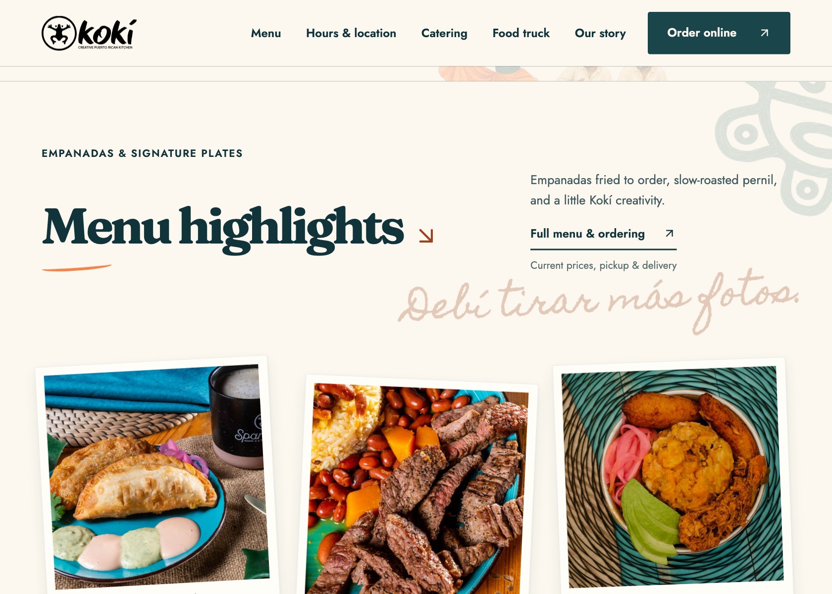
We developed the art direction from client-supplied photographs and cultural references including Bad Bunny, bomba, and plena. The work connected image styling, menu organization, and dish naming across the website and printed menus.
A cultural reference,
made visual.
The Bad Bunny reference informed the Polaroid-style framing of the restaurant’s photographs. The bordered, snapshot-like presentation gives the images a personal, collected feel while keeping the client’s food photography at the center.
Colored-pencil styling adds an artisan quality to the illustrated details. Teal typography and warm accents bring the photographs and illustrations together, giving the composition a consistent palette.
Working with what the client supplied
The restaurant provided the photographs. We developed their presentation and the surrounding art direction: the framing, illustration treatment, color, and typography that give the material its character on screen and in print.
A place that
feels alive.
Waves move at El Morro, and Taíno symbols animate through the site. These details bring movement to the cultural imagery and give kokí’s digital presence a sense of life.
A menu arranged
to guide attention.
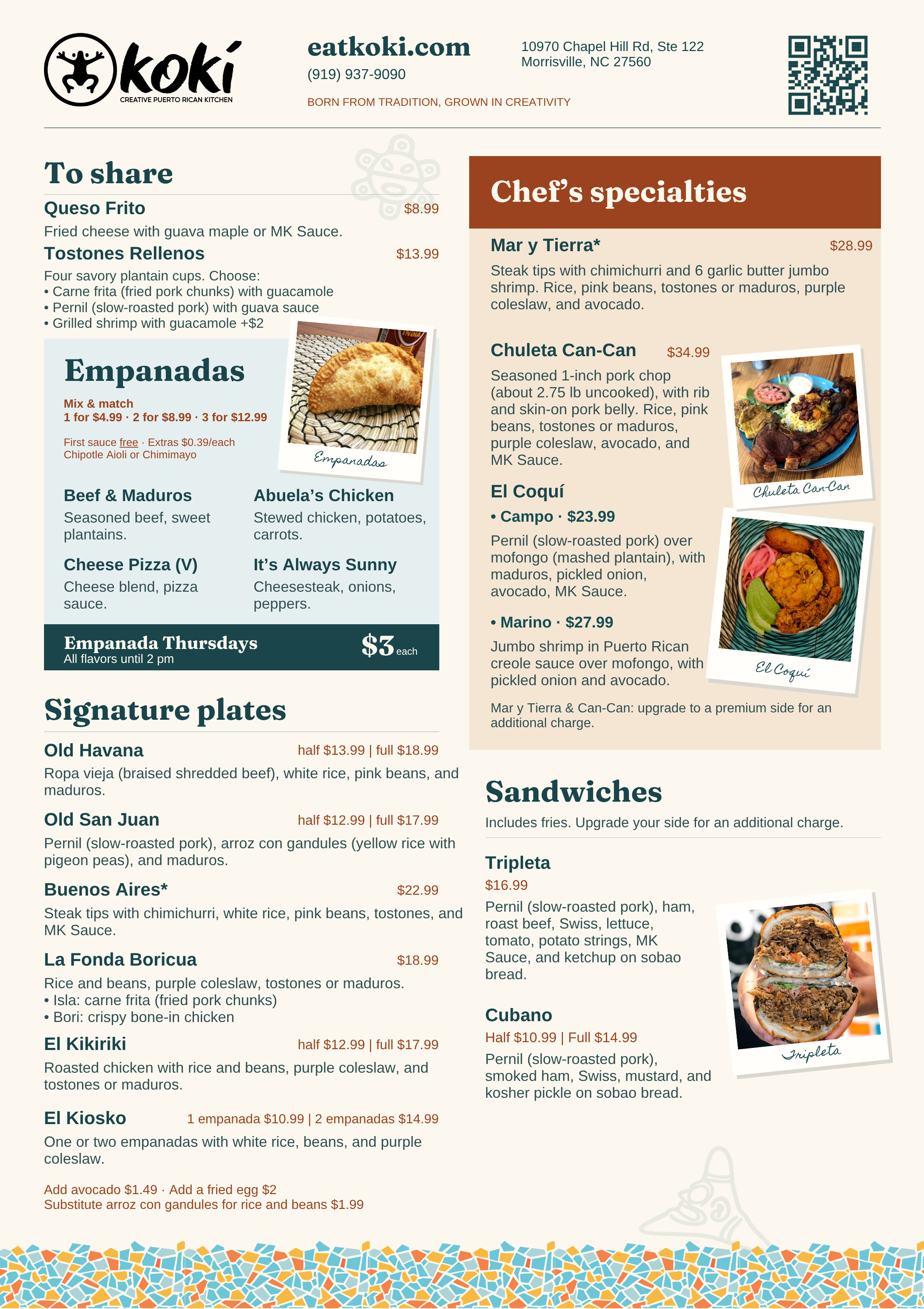
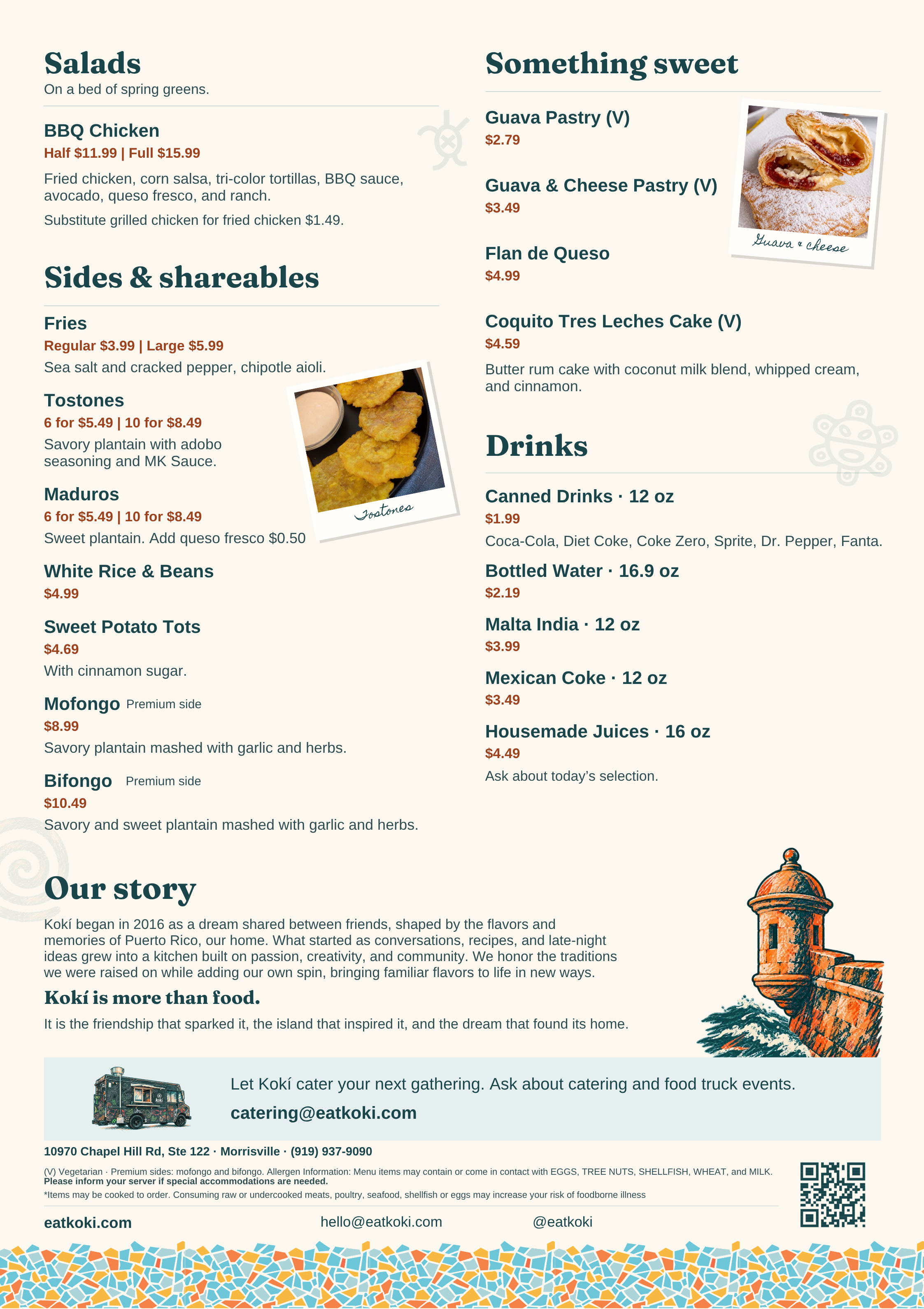
The menu organization was designed to support sales of selected items while keeping the wider offering easy to explore. Category grouping, placement, and typographic hierarchy give those dishes emphasis without making other choices feel secondary or difficult to find.
The proofs below show the category structure, emphasis, and supporting descriptions. They document the design and are not a source for current prices.
Familiar to some.
Clear to someone new.
Translated dish names help guests discovering Puerto Rican food understand what they are choosing. Inline callouts preserve the traditional names for people who already know and look for them.
The two naming layers sit together in the reading flow, supported by descriptions that help guests recognize a favorite or discover something new.
Keep the design.
Change the menu.
The menu masters were built in Canva so the team can update dishes, descriptions, and prices within the established layout. The website connects guests to Toast for current ordering and checkout, with separate inquiry paths for catering and the food truck.
Visit kokí (opens in a new tab)Have something
in mind?
Bring us the idea. We’ll work through the design and the build.