
The Lover’s Bite
A gluten-free niche.
An appetite of its own.
- Visual direction & responsive UI
- Front-end development
- Toast ordering & inquiry integrations
The challenge
The Lover’s Bite serves a gluten-free niche, with a food offering and personality of its own. Its website needs to make that specialty clear while giving guests a reason to explore the food. The challenge is to lead with appetite and identity, then make ordering a meal or asking about catering straightforward.
Our approach
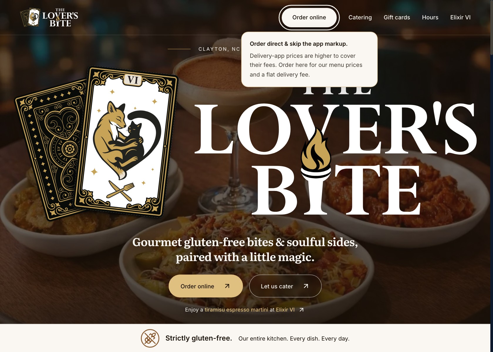
We paired a clear gluten-free identity with food photography, tarot-inspired artwork, and expressive Literata typography. The food and the brand lead the experience, while ordering and catering remain easy to find. Ordering connects to the existing Toast system for current menu prices, availability, and checkout.
Food first.
Personality throughout.
Food photography gives the gluten-free offering an appetizing introduction. Tarot-inspired artwork adds the kitchen’s personality, and expressive Literata typography gives the headlines a distinctive voice.
The design pairs that character with clear ordering and catering actions. Responsive composition keeps the food, identity, and next steps together as the screen gets smaller.
A specialty with its own visual identity
- Gluten-free positioning explains the kitchen’s focus.
- Food imagery shows what guests can look forward to eating.
- Literata headlines and tarot-inspired artwork establish the visual voice.
- Direct Toast links keep ordering connected to the kitchen’s current menu and checkout.
A small interaction
with a clear purpose.
The ordering link explains the direct-ordering option when it receives keyboard focus or a mouse hover. The guidance stays near the control and dismisses with Escape or an outside interaction.
The link itself still behaves like a normal link. Guests can continue straight into ordering.
Explore the live site (opens in a new tab)Design and implementation together
- Visible keyboard focus and contextual guidance.
- Ordering and catering presented as separate actions.
- Responsive navigation and layouts.
- Toast owns checkout and current menu availability.
The same character.
A smaller canvas.
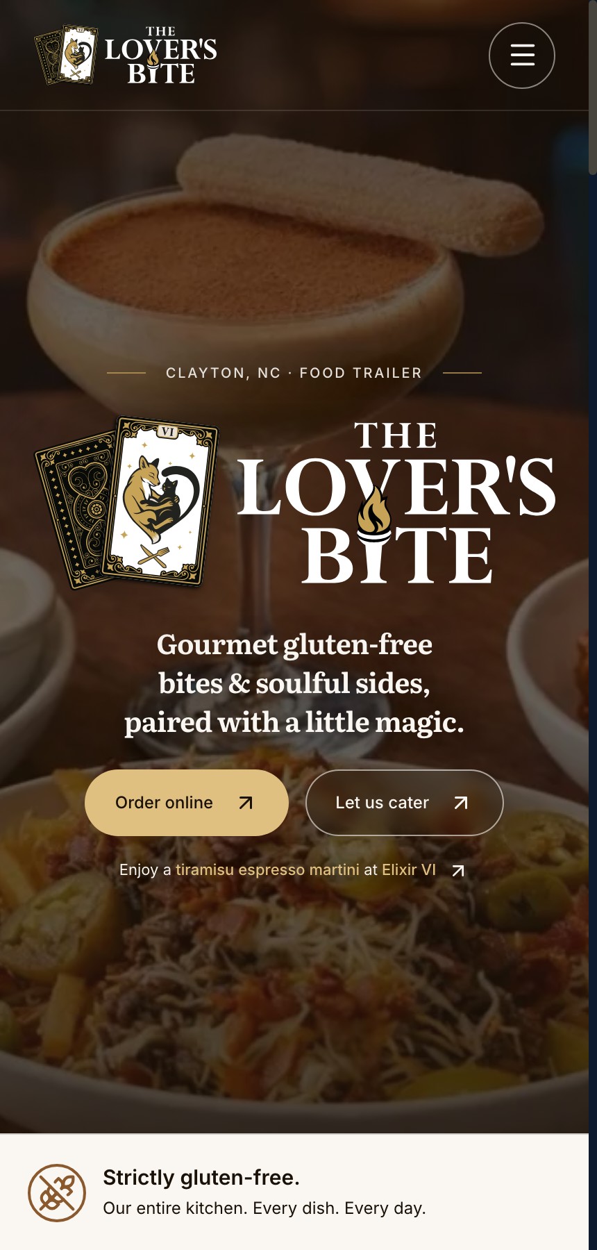
On mobile, the artwork, typography, and food-led presentation remain recognisable. Navigation compacts while the ordering and catering actions stay together in the main experience.
That is the practical work of responsive design: composing the experience for the available space, then implementing the interactions around it.
Captured from the live website at a 430px viewport.
A kitchen with
a connection to the bar.
The Lover’s Bite’s site points guests toward Elixir VI, while the bar’s site introduces the food offering. Those connections make it easier to discover both parts of an evening without losing the kitchen’s own focus on gluten-free food, ordering, and catering.
The tarot-inspired artwork and playful language give the brands a family resemblance; the food photography and Literata typography give The Lover’s Bite its own expression.
Explore the Elixir VI case studyBuilt around the
next useful action.
The website presents the gluten-free specialty as part of a distinctive food business. Guests can discover the kitchen’s character, explore what it offers, and continue to ordering or catering. The visual identity and the practical paths work toward the same goal: making the business easier to understand and choose.
Visit The Lover’s Bite (opens in a new tab)Have something
in mind?
Bring us the idea. We’ll work through the design and the build.